GIG Retail Brand Identity Refresh
WHAT I DID
Visual Identity
Brand Strategy
Template Design
Animation
The Brief
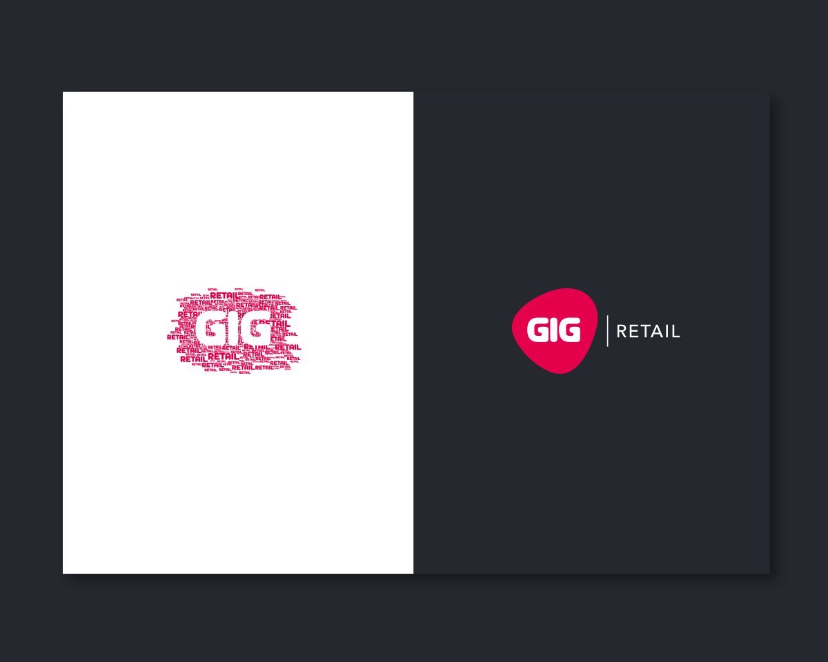
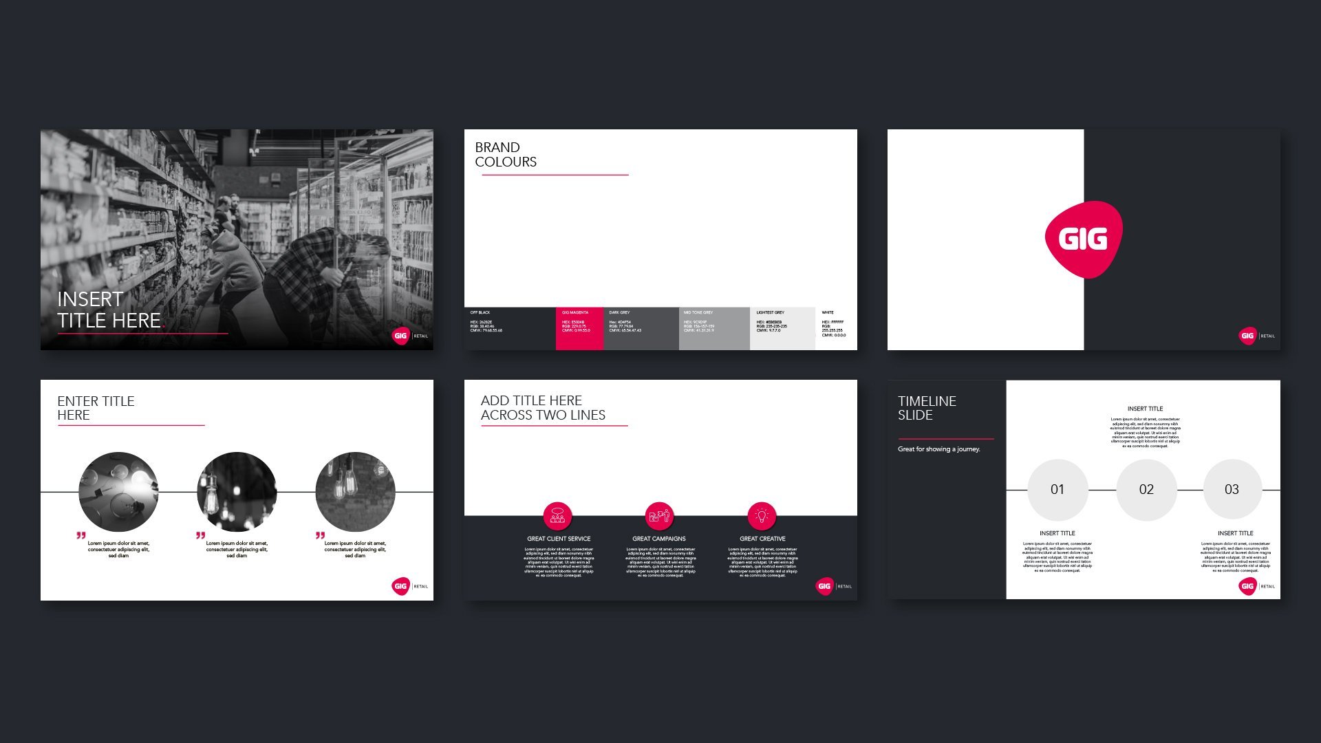
Whilst working at GIG retail, my greatest achievement & pleasure was working on a complete brand refresh for the companies external and internal communications. The old logo looked dated and no longer represents the brands authority & reputation within the retail marketing industry. The client wanted to keep the core magenta colour as well as the original font used in the previous logo. The visual identity also needs to be flexible and adaptable for future extensions of the company.
The Idea
I wanted to introduce a more corporate aesthetic to give the impression of an industry expert, whilst staying true to the fun and playful values that GIG embodies. The use of magenta as an accent colour, rather than primary does this in a subtile way, whilst retaining legibility across all branded content. To further incorporate the brands playfulness in internal communications, I used energetic animation where possible.


