Hearth & Hammer Brand Identity
WHAT I DID
Logo Design
Branding Strategy
Packaging
Social
The Brief
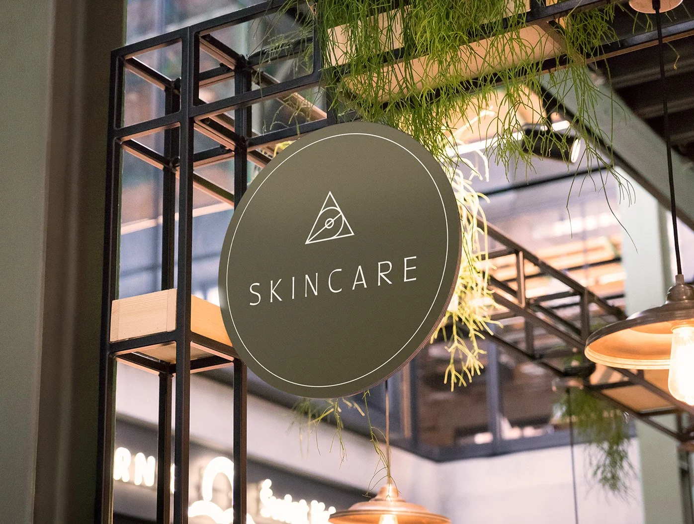
Hearth & Hammer is a modern apothecary inspired by ancient alchemy (the transformation of elements into gold). They sell tonics, elixirs, lotions and remedies to meet your health, beauty, and wellness needs. It’s situated in a brick-and-mortar shop with a distressed, old age atmosphere. The client wanted their branding to reflect this, they also want elements of modernity and illustration. Their goal was to make natural healing remedies more accessible.
The Idea
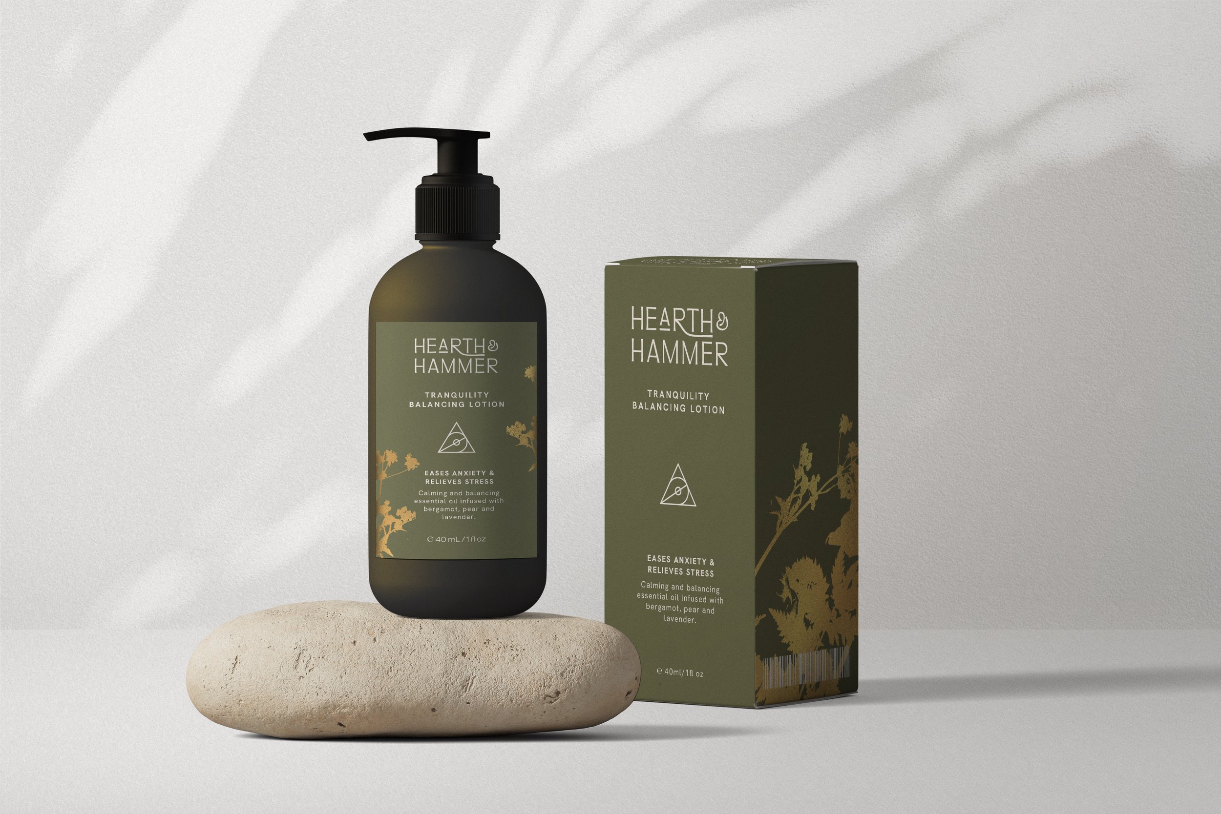
I wanted to create a modern, clean design that would stand out from the industrial textures of brick and wood in the physical store. As all the product ingredients are natural, I wanted to reference this by adding flowers to the packaging coated with a gold foil for extra dimension.

The symbol of perfection
In alchemy, gold and the Sun are represented as one and the same, perfection. Inspired by old symbols and and sacred geometry, I created a modern, minimalist logo & a brand mark referencing the hearth, hammer, botanical ingredients & gold.
The colours are muted and warm for a contemporary but natural look. The logo strikes the balance between modern and old, I paired it with a geometric san serif for the supporting typography to keep everything clean & legible.