Sun Branding Website Design

PROJECT DETAILS
Scope: Website redesign & animation
Role: UX/UI Designer
Duration: 4 Months
Tools: Figma (wireframing, prototyping & collaboration). Photoshop/Illustrator (image editing & asset creation)
After Effects (Animations)
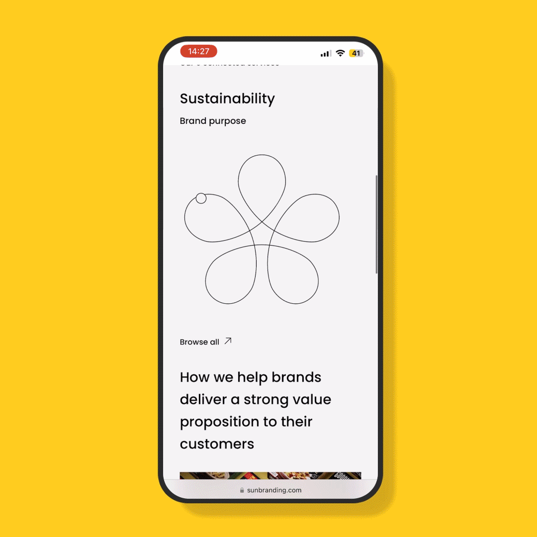
URL: sunbranding.com
Overview
Sun Branding is a creative studio that grows brands through packaging, delivering a wholly integrated approach that generates a truly unique and cost effective world-class packaging.
Their website had been left unchanged for years, it was outdated, uninspiring and failing to attract new clients, as well as not effectively showing the breadth of services on offer.
In collaboration with the creative design team, I helped create a responsive, engaging user experience, adhering to the brands refreshed visual identity and showcasing their body of work in line with their competitors.
The team
Team: Design
Design director, 2x graphic designers
My role was to:
Conduct competitor websites and analysis design patterns, and come up with a consistent and adaptive design system.
Create low & high fidelity prototypes for desktop and mobile in Figma.
Iterate on prototypes following meetings with stakeholders and user feedback.
Liaise and present progress to external web developers and upper management.
Research
Users are looking for cost effective, sustainable packaging solutions for their company/brand with a short lead time.
From analysing past/existing users, we determined 3 types of users;
Large retailers such as Aldi and Walmart, with vast collections of products, wanted fast and cheap.
NPDs from small, independent brands such as Mighty, looking for a sustainable, world-class design and value for money
Brands that require non-creative services from industry experts to simplify getting their product to market.

User Personas
-

Linda
ACCOUNT DIRECTOR
Account Director for a large retailer She’s 46, and works at the head office, after seeing a decline in sales, she needs to increase sales quickly to ensure her job is safe. Their current design agency have been showing a steady decline in the standard of work.
Linda is keen to find another experienced packaging agency that has worked with big retailers before and can produce quality work to tight deadlines.
-

Paul
ENTREPRENEUR
CEO and Owner of a non-dairy yoghurt company. He’s 39 and an entrepreneur, having just acquired serious investment for his quickly growing business, he needs his expanding line of products to stand out in a very competitive market.
He needs an experienced packaging agency to establish a memorable brand identity as well as handle the legal requirements so he free up his time and continue growing the business.
-

May
SHOP OWNER
May, 31 is in the process of opening a farm shop, selling food and drinks made from ingredients from her families’ farm, before opening she needs detailed and straight forward advice on the the legal requirements of her packaging.
She wants to work with an experienced and trustworthy consultant to ensure that she can sell her product lawfully.
Key Insights
-
No clear way for each user to navigate to the relevant information
Users struggled to find the information they felt was most relevant to them.
-
Limited case studies
Users were expecting a larger number of recent case studies. On the case studies that were visible users commented that they were minimal, short and lacked the excitement of competitors websites.
-
Dated & Uninspiring UI
Users found that the website was dated and lacked engaging content and imagery. When compared to other competitors websites, Sun’s website was ‘dull’ and ‘unimaginative’.

Our focus
-
As the list of services Sun Branding provides is long and targets diverse groups of people, there is vast amounts of information
Because of this, it is important that there are comprehensive breakdowns of each service, and the IA allows for users to navigate to relevant service sections easily.
-
Evidence of Sun’s recent and notable design work was not present on the website, so users were not aware of the quality of creative work that they could expect.
or Sun to keep up with competitors they need to really showcase their work, and create compelling case studies so users turn into clients.
-
Because of the vast amount of info, Sun need to use design choices that make the user experience easily across all device sizes.
The Process
-

Ideation
After distilling our research findings and performing competitor reviews, we created low fidelity mockups according to the AI created with senior management and key stakeholders.
My designated tasks were to create mobile versions of existing desktop designs, create a case study page template and integrate animation.
-

Prototyping
As the most experienced Figma user in the team, I was responsible for creating the high fidelity mockups for meetings with the key stakeholders. Which involved making design amends in real time.
-

Testing and Iteration
Over the duration of the project the prototypes where constantly tested by users and the wider team in critique sessions. Any feedback was implemented by me in figma.
The result
-
![]()
Inspiring Visuals
-
![]()
Powerful Case Studies
-
![]()
Fully Responsive Design
-
![]()
Comprehensive Services Breakdown


Achievements & Learnings
-
Working in a team of three presented some unique challenges, especially since there was no 'lead UX designer' or team members with a digital design background, making me the most experienced in this area. This occasionally required me to highlight elements that could be problematic, which sometimes was met with resistance.
For instance, when designing a responsive website, the initial designs focused solely on desktop, overlooking the needs of mobile users.
This meant we had to adapt the layout to account for different screen sizes. Bringing these concerns back to the user was key, as UX is ultimately about creating designs that prioritize user needs over personal preferences.
-
During this project, I learned that accessibility is often an overlooked aspect of design.
In the early iterations of the website, I noticed that font sizes were quite small, and there were several instances where the colour combinations did not provide enough contrast.
This experience highlighted the importance of always considering accessibility in design to ensure that the final product is inclusive and user-friendly for everyone.
-
Enviably in projects, there is going to be a difference of opinions, working with stakeholders and senior managements teams outside of the design lens can be challenging, there is always a tendency to add more content or copy, and its the UX design teams role to push back when needed.
Sometimes its works but sometimes it doesn't and you have to do as requested rather than whats best for the user. Ive learnt that when that happens, self-reflect and think of how I might have better got my point across.
-
Attending meetings directly with developers was both enjoyable and insightful. Having the opportunity to ask questions, no matter how simple, and discuss what is feasible was incredibly valuable.
This collaboration helped ensure the design was practical and achievable from a development perspective.