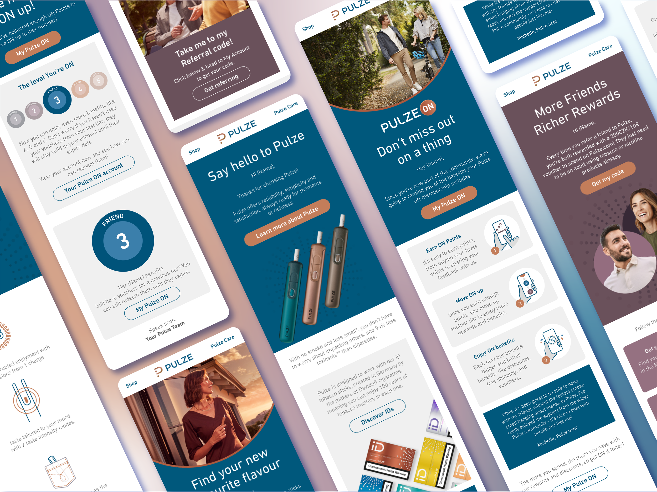
Pulze e-CRM Design
PROJECT DETAILS
Scope: Email campaign design & implementation
Role: UX/UI Designer
Duration: 6 Weeks
Tools: Figma (wireframing, prototyping & collaboration). Photoshop/Illustrator (image editing & asset creation)
Overview
This project features the design and optimisation of email campaigns for Pulze, a newer brand in the heated tobacco industry, with markets in Greece, Czech, Italy and more to come. The goal is to create visually appealing, responsive, and engaging email templates to improve user interaction and drive conversion rates. The entire design process is executed using Figma, emphasising the importance of user experience and user interface principles in email marketing.
Context
Pulze faced challenges in user engagement through their email campaigns. Existing templates lacked visual appeal, and open rates were suboptimal. The goal was to enhance the overall design, improve click-through rates, and communicate key messages effectively.
The Problem
Low engagement and click-through rates in existing email campaigns.
Inconsistent branding and design elements across different communications.
No considerations for mobile users.
Lack of visual hierarchy and compelling content to captivate the audience.
The Solution
-
We implemented a visual overhaul of the email templates, incorporating a clean and modern design with a focus on product aesthetics.
Established a consistent colour scheme and typography to reinforce brand identity.
-
Layouts were restructured to prioritise key messages and calls-to-action.
We utilised responsive design principles to ensure optimal viewing on various devices.
-
Dynamic content sections were introduced to showcase personalised product recommendations and promotions based on user preferences and behaviour.
-
The team emphasised clear and concise calls-to-action, guiding users towards desired interactions.
We also Incorporated exclusive incentives and promotions to encourage click-through.
The Process
-
We conducted competitor analysis, user surveys, and studied industry trends to inform design decisions and understand user preferences in the heated tobacco market.
-
The design team brainstormed and collaborated with the marketing team to generate creative ideas for visually appealing and engaging email content.
We explored various layouts and design elements and planned the information architecture, ensuring a logical flow of content for optimal user engagement.
Then we created wireframes to define the layout and structure of the email templates.
-
The email templates were designed to be responsive on various devices, including desktops, tablets, and smartphones.
-
The visual language used aligned with the refreshed Pulze brand identity, incorporating emotive imagery, and a modern colour palette.
The high-fidelity prototype of the email templates were created in Figma with custom imagery and icons to enhance visual appeal and convey key marketing messages.
-
Feedback on the design came from international marketing teams, creative directors and developers
I refined the designs based on this feedback in figma to enhance their usability and aesthetic until all stakeholders where happy.
-
The redesigned email campaigns for Pulze Heated Tobacco Company successfully improved user engagement, resulting in a significant increase in click-through rates.
The introduction of reusable content modules helped to create a cohesive campaign that consumers can trust and interact with.


